
Seaside
Vodka
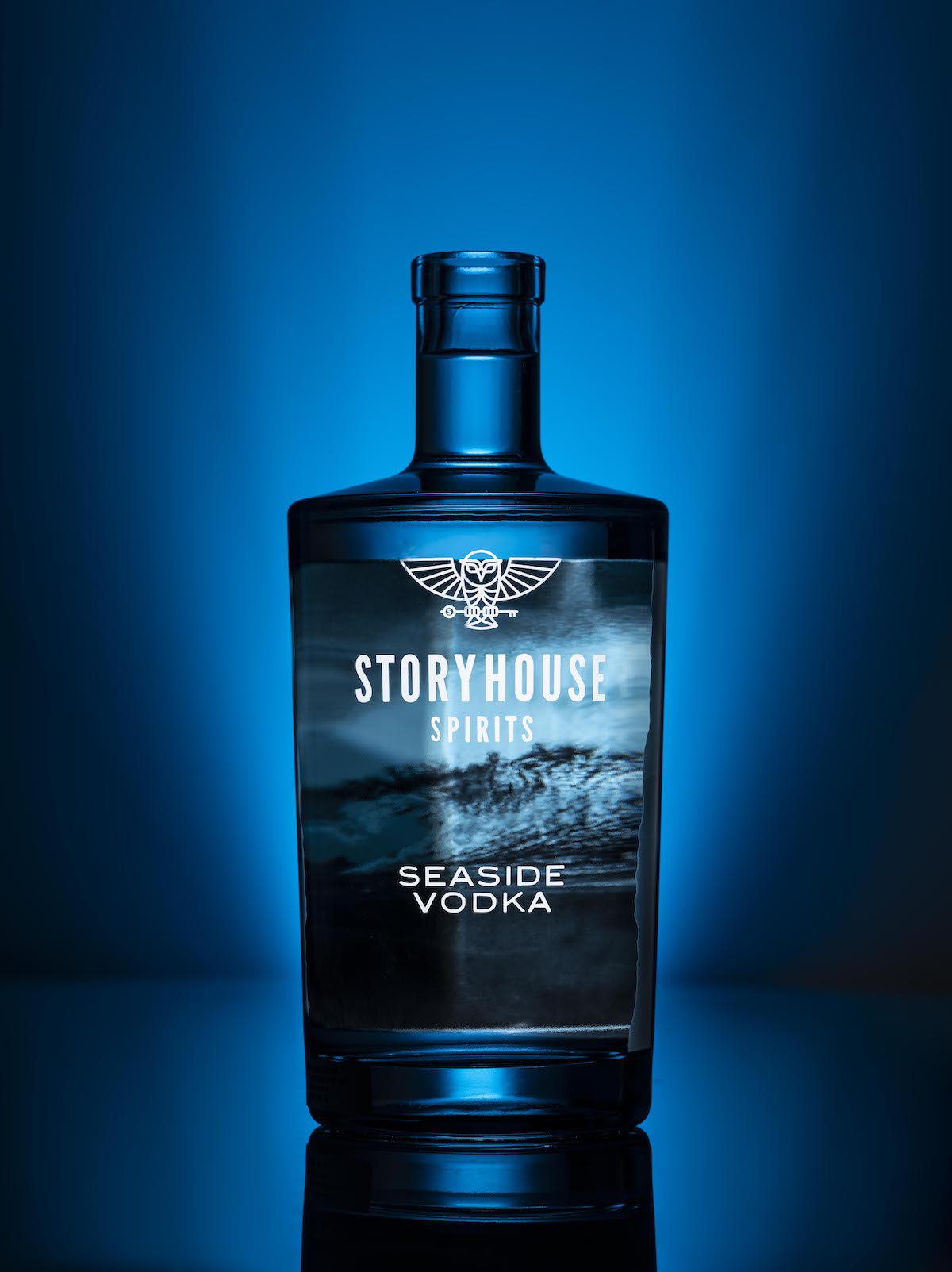
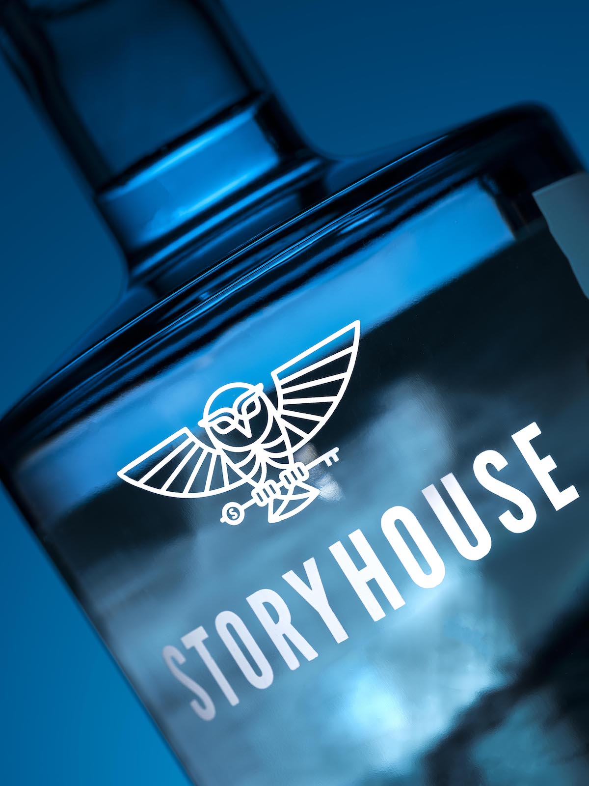
The concept of a direct-printed spirit bottle with a reversed back label, utilizing ceramic inks in three distinct colors, represents an innovative approach to packaging design. This method involves applying ceramic inks directly onto the surface of the bottle, which allows for a high degree of customization and durability. The use of ceramic inks is particularly advantageous because they offer excellent resistance to fading, scratching, and chemical interactions, ensuring that the bottle maintains its aesthetic appeal and legibility over time.
In this design, the reversed back label is a unique feature that sets the bottle apart from traditional labeling methods. Instead of a conventional front-facing label, the back label is printed in reverse, creating a striking visual effect when viewed through the clear glass of the bottle. This reversed label design can enhance the overall presentation and add an element of intrigue for consumers, as it provides a glimpse of the bottle’s contents and branding from an unconventional angle.
The choice to use three different colors of ceramic inks further enriches the design, allowing for a vibrant and eye-catching appearance. Each color can be carefully selected to complement the spirit inside the bottle, align with brand identity, or create a visually appealing contrast. The combination of multiple colors adds depth and dimension to the label, making it more engaging and memorable.
Overall, this direct printing technique with reversed back labeling and ceramic inks not only elevates the visual appeal of the spirit bottle but also enhances its functional durability. It reflects a commitment to quality and creativity, offering both aesthetic and practical benefits that can distinguish the product in a competitive market.
Email us today for more information and discover how we can elevate your packaging.